Today, we're thrilled to share the journey behind the redesign of Monroe Sport Center and Mugsy's Sports Grille & Bar logos. I had the great pleasure of working closely with my brother and sister-in-law, Matt and Sharon, on this project!
Read More
This blog is a place for encouragement, color + design inspiration, tips for creative entrepreneurs and small business owners, and general creative musings.
Creative people need to be around creative people to thrive. When life is busy, it can be hard to make those connections, so the Art is a Record Creatives Community was born. Join our private Facebook group, where you can ask questions, share what you're working on, and be inspired. It is a place where we can share with confidence and encourage each other to grow. I hope you’ll join us!
Today, we're thrilled to share the journey behind the redesign of Monroe Sport Center and Mugsy's Sports Grille & Bar logos. I had the great pleasure of working closely with my brother and sister-in-law, Matt and Sharon, on this project!
Read MoreThe 2024 PANTONE Color of the Year is PANTONE 13-1023 Peach Fuzz! This calm and comforting color is said to promote well being for our mind, body, and soul.
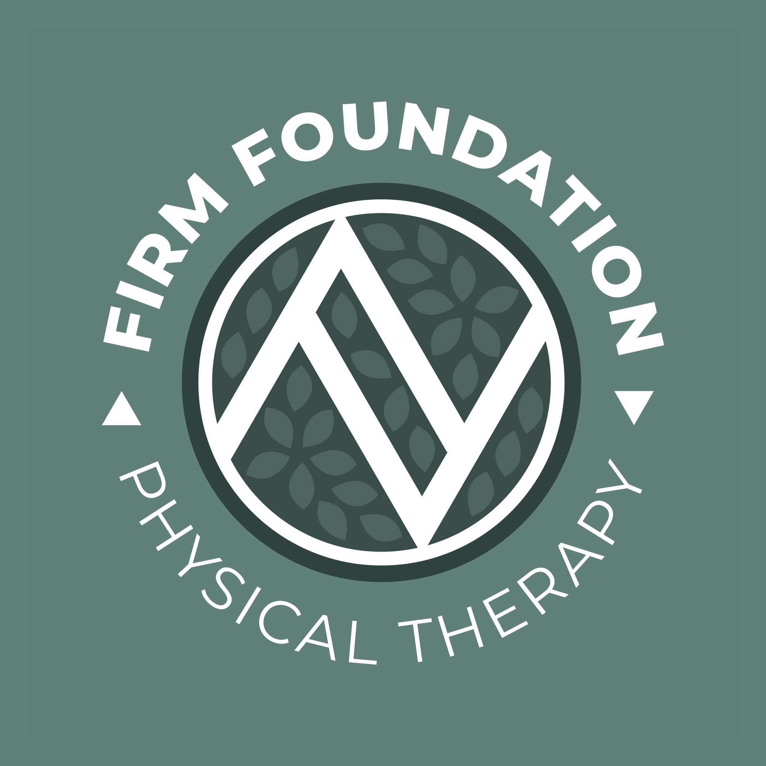
Read MoreWe recently had the pleasure of crafting a visual identity for Kristie Mulder’s latest venture, Firm Foundation Physical Therapy. In our initial planning session, Kristie expressed her commitment to offering personalized, one-on-one care that goes beyond traditional physical therapy.
Read MoreIt’s hard to find something more joyful than a field full of sunflowers! I keep seeing them on drives and I thought these would be the perfect subject for a new color palette collection.
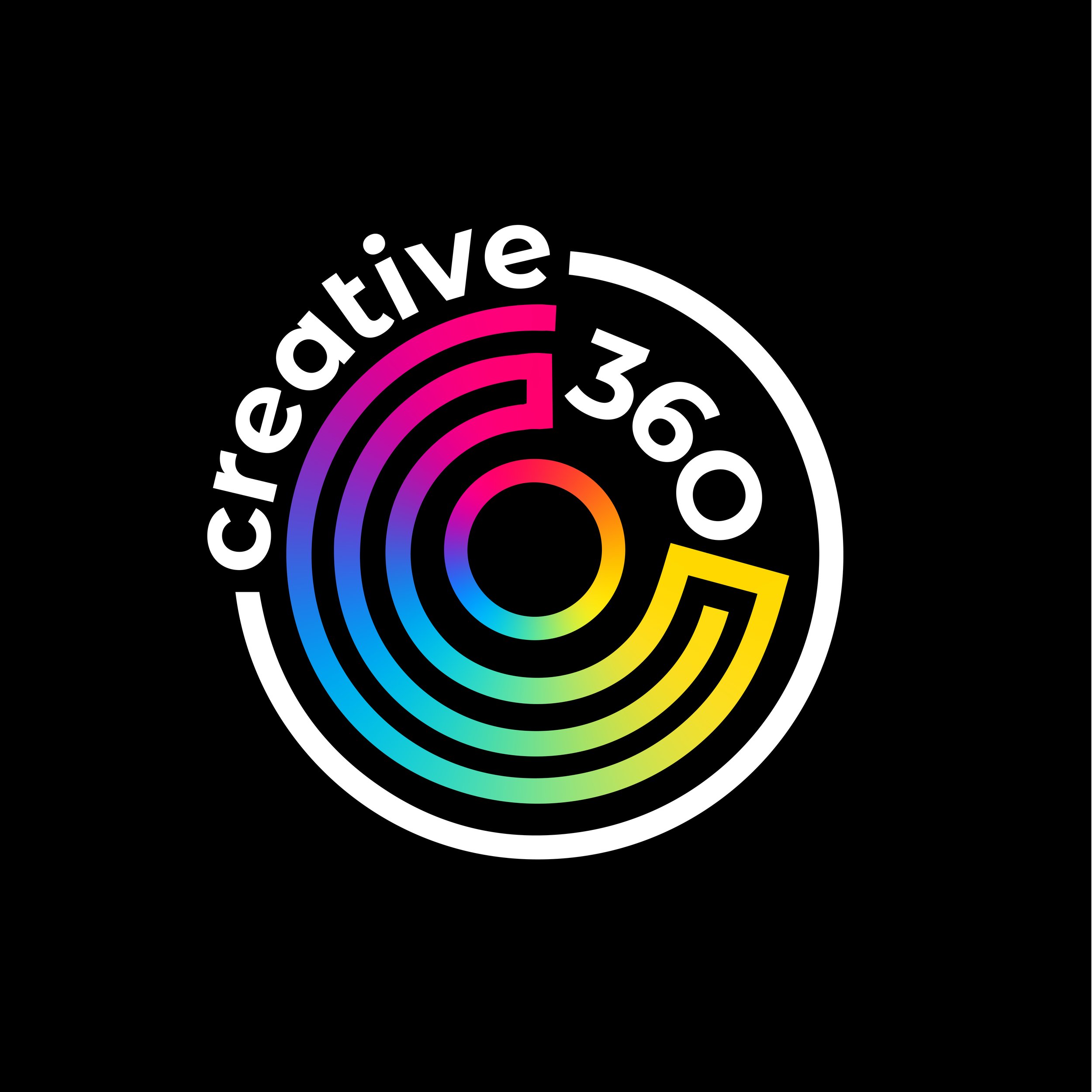
Read MoreFor this rebrand Creative 360 wanted something fresh, accessible , and alive. Creative 360 is all about opening doors for people and providing space to help people realize their dreams. I wanted to give them a logo that felt dynamic and interesting, but was also bold and clear.
Read MoreIt’s Dahlia season here in Michigan and I just love these complex and colorful flowers. They come in so many varieties and color combinations, I thought they would be perfect to feature in a collection!
Read MoreWorking with Mária to create this logo and visual identity for her new parent coaching business was wonderful! We started with a great planning session where had a conversation around what her goals were and how she wanted her clients to feel when they interacted with this brand.
Read MoreThis color palette collection is brought to you by my daughter, Allison, one of my junior designers this summer. Our family has always loved watching the birds around our home, or when we’re out in nature.
Read MoreThis color palette collection is brought to you by my daughter, Madeline, one of my junior designers this summer. Madeline loves pastel colors because they’re cute and mellow. The soft soothing tones of pastels can feel downright dreamy.
Read MoreWorking with the team at Clearbrooke Products to create a custom visual identity for the cleaning product, Banexa, was such a fun process!
Read MoreThere is so much beauty in the dark and weird, the offbeat and the moody. This opinion may be a result of years of watching Tim Burton movies, I can’t say for sure, but that sort of beauty is the inspiration for this color palette collection.
Read MoreIt was a joy to work with Jill from Center City Studio to create this brand identity for her boutique fitness center, in Midland Michigan!
Read MoreIt’s just days away from the first official day of spring, and I’m so excited! There’s so much hope in spring; so much possibility. There are so many plants that come alive and paint the earth with beautiful colors after months of cold and gray.
Read MoreMax Loves Midland is your entertainment, resources, and collective improvement hub for Midland County, Michigan. Visit MaxLovesMidland.com to utilize the county wide community calendar and to learn more!
Read MoreColor is still my favorite. I love finding new combinations of colors for my own art work, design clients, and I love sharing them here with you! I thought the beginning of this year would be the perfect time to look back at the top ten most pinned color palettes of 2022, according to YOU via my Pinterest page!
Read MoreWe don’t need art. It’s completely unnecessary to live, but for some it’s completely necessary to feel alive.
Read MoreThe 2023 PANTONE Color of the Year is Viva Magenta 18-740! This joyful color is said to promote optimism and show bravery. Here’s what PANTONE has to say about their choice for the upcoming year:
Read More