
Logo Reveal: Gavin Financial Group

It was such a pleasure to create the visual identity portion of rebranding of Gavin & Associates to Gavin Financial Group! The logo design process began by meeting with the owners, Michael and Connie Gavin, in their very stylish office on Eastlawn Drive, here in Midland, Michigan. When I walked in I was immediately drawn to their plant wall and the variety of art featuring the golden ratio around the lobby. The golden ratio is derived from Fibonacci numbers, which are a series of numbers where each number is the sum of the two previous numbers. It’s a ratio we see over and over again in nature, in art, and can even be applied to finance, which we discussed.
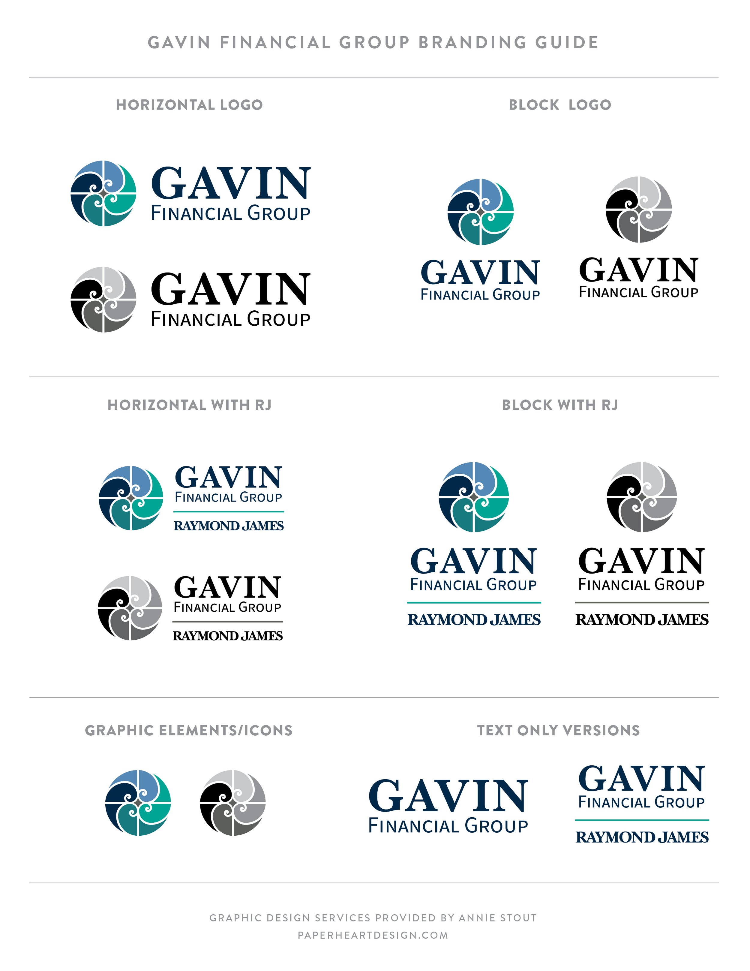
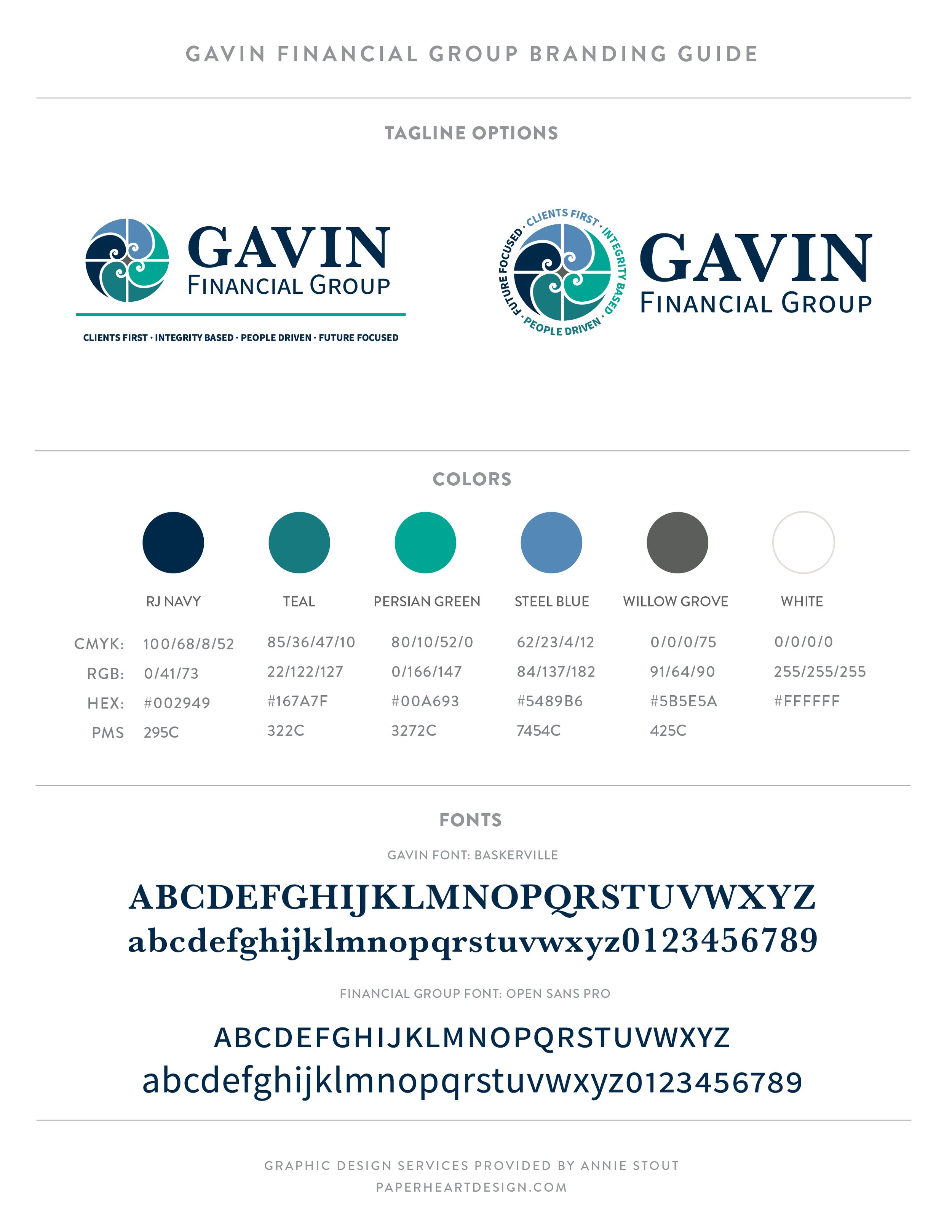
After several initial concepts, half of which were rooted in the idea of the golden ratio, and several edits the team landed on this clean, modern logo, that also coordinates with their parent company, Raymond James. This is a very versatile logo suite which includes block and horizontal versions with a stand alone icon, and several alternatives with and without their tagline or parent company logo.
Once the logo was set we dove right into creating business cards, letterhead, notepads, envelopes, and more, so they had everything they needed to launch the new look!
Learn more about all that Gavin Financial Group has to offer here!


In an effort to foster a creatives community I’ve started a Facebook group called Art is a Record Creatives Community, the same name as this blog. I would love for you to join in the fun as we discuss creative living, projects, art, and life.
