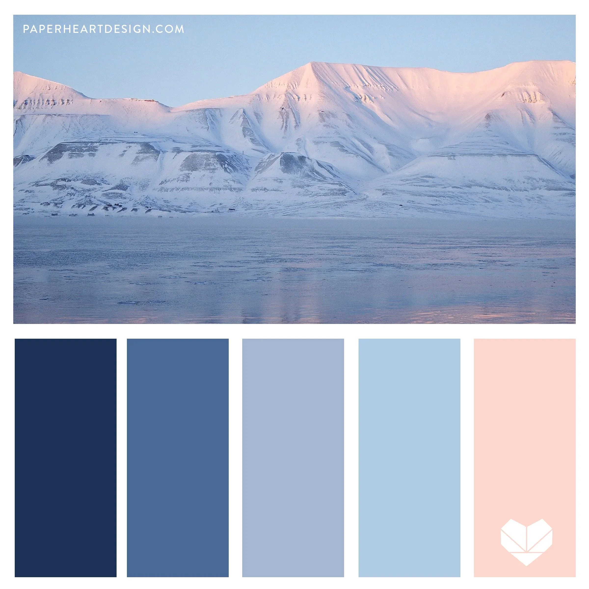
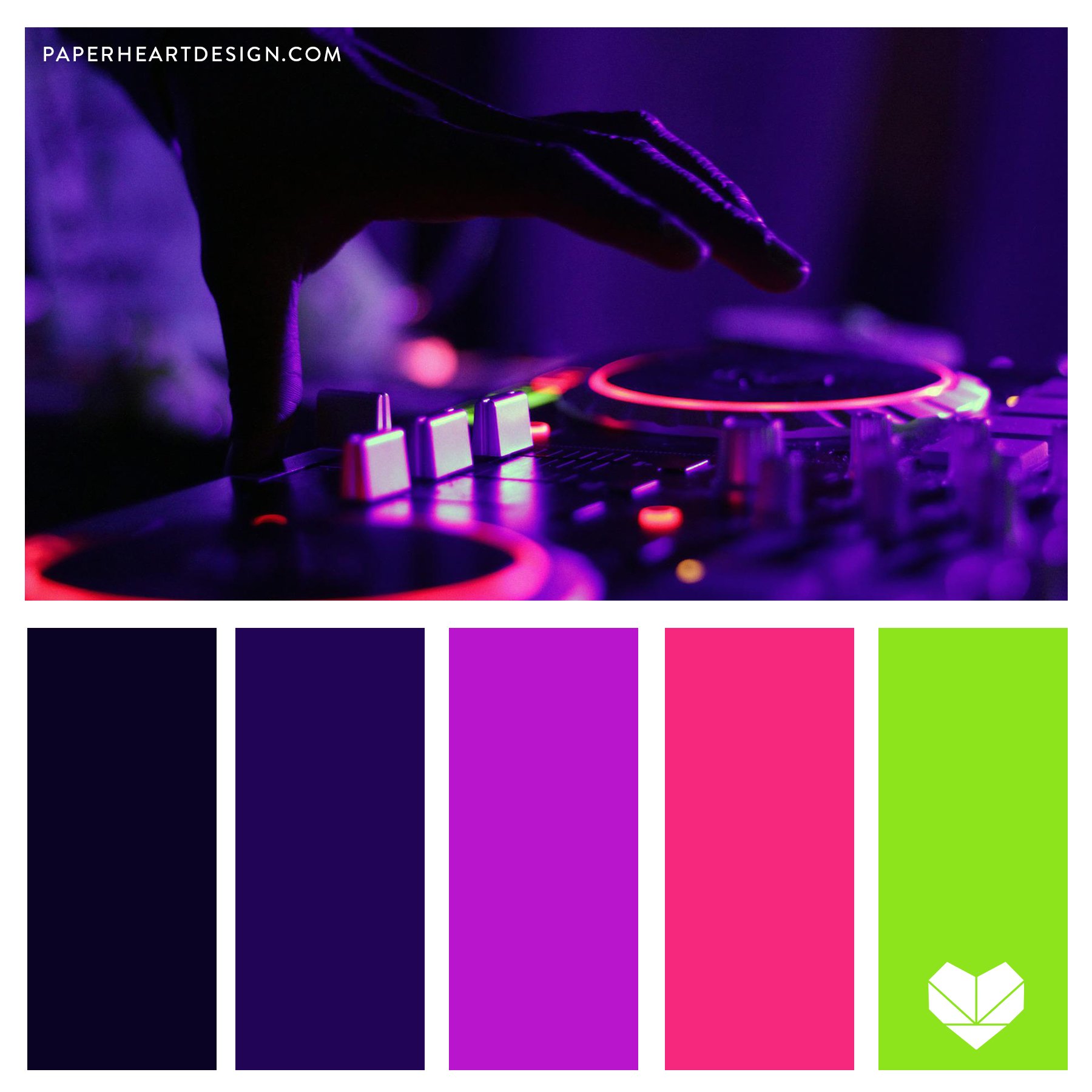
We love color, and we know you do too! Below are some of the most common questions we get about our color palettes.
What is a hex code?
A hex code is a six-digit code that represents a specific color in digital design. It’s used in graphic design software like Adobe Creative Suite, Canva, website design, and other digital applications to ensure color consistency. For example, the hex code #FF5733 will always give you the same shade of orange, no matter where you use it.
What paint color is this?
The colors in our palettes are digitally selected, meaning they don’t always have a direct match in traditional paint collections. However, many hardware or paint stores offer color-matching services where they can scan a digital color and mix a close match. You can also compare the color to physical paint chips using your phone or computer screen as a reference—but keep in mind that screens display colors differently based on settings and lighting.
Can I use these colors for my art, logo, or branding?
Yes! Our color palettes are free to use, whether you’re creating artwork, designing a logo, or building a brand identity. If you’re using them for branding, we always recommend testing them in different formats (print, digital, merchandise, etc.) to make sure they look the way you want across all platforms.
Need help with color selection?
If you’re unsure how to use these colors in your branding or design projects, we’d love to help! Paper Heart Design Co. specializes in creating cohesive, intentional color palettes that reflect your brand’s personality and vision.
How do I use the Procreate Color Palettes?
Follow these steps:
Download the
.swatches
file to your iPad.Open the Files app on your iPad and locate the downloaded
.swatches
file.Tap on the file, and it will automatically open in Procreate.
Your new color palette will appear in the Palettes section of the Color Picker in Procreate.
Now you're ready to start creating with your new Procreate color palette!
Enjoy browsing the site and feel free to send us a message if you have additional questions or would like to hire us to create a custom palette for you!
Browse Color Palettes
The 2025 PANTONE Color of the Year is PANTONE 17-1230 Mocha Mousse! This warm brown hue is “imbued with an inherent richness that nurtures with its suggestion of the delectable quality of cacao, chocolate and coffee, appealing to our desire for comfort.”
Spooky season is my favorite. I love fall. I love Halloween. It's cozy, it's creepy. All the best movies... I could go on... but instead, let’s dive into the colors of the season!
It’s still hot outside, but it’s officially fall! My favorite season. Here’s a color palette collection all about autumn! The color changes, the lowered temperatures, the crunchy leaves… it’s just the best. I’ve got my jeans and hoodies ready, just waiting on the lower temps!
School may be back in session, but summer isn’t over yet! There’s still time for warm walks with your toes in the sand, swimming in the sea, and there’s always time to drink the wild air. Living in Michigan, lake beaches are my favorite, but the few times I’ve been to the ocean left me in awe.
I have always been fascinated by the northern lights. They are elusive, strange, and otherworldly, like something from folklore, but it’s real. I like things that are science, but feel a bit like magic. I’ve not yet experienced aurora borealis in person yet, but it’s on my bucket list.
When my daughter suggested I create jellyfish color palettes, I wasn’t sure if I could find enough interesting images to make up a full color palette collection. When we started searching for photos I was blown away by all the brilliant colors I was seeing!
The 2024 PANTONE Color of the Year is PANTONE 13-1023 Peach Fuzz! This calm and comforting color is said to promote well being for our mind, body, and soul.
It’s hard to find something more joyful than a field full of sunflowers! I keep seeing them on drives and I thought these would be the perfect subject for a new color palette collection.
It’s Dahlia season here in Michigan and I just love these complex and colorful flowers. They come in so many varieties and color combinations, I thought they would be perfect to feature in a collection!
This color palette collection is brought to you by my daughter, Allison, one of my junior designers this summer. Our family has always loved watching the birds around our home, or when we’re out in nature.
This color palette collection is brought to you by my daughter, Madeline, one of my junior designers this summer. Madeline loves pastel colors because they’re cute and mellow. The soft soothing tones of pastels can feel downright dreamy.
There is so much beauty in the dark and weird, the offbeat and the moody. This opinion may be a result of years of watching Tim Burton movies, I can’t say for sure, but that sort of beauty is the inspiration for this color palette collection.
It’s just days away from the first official day of spring, and I’m so excited! There’s so much hope in spring; so much possibility. There are so many plants that come alive and paint the earth with beautiful colors after months of cold and gray.
Color is still my favorite. I love finding new combinations of colors for my own art work, design clients, and I love sharing them here with you! I thought the beginning of this year would be the perfect time to look back at the top ten most pinned color palettes of 2022, according to YOU via my Pinterest page!
The 2023 PANTONE Color of the Year is Viva Magenta 18-740! This joyful color is said to promote optimism and show bravery. Here’s what PANTONE has to say about their choice for the upcoming year:
I am always so easily drawn to the colors and beauty in nature. It takes a little more effort to find the beauty in man made things. In this collection I dive into the unnatural colors we find in the strange beauty that is neon lights and the spaces they often exist.
The following collection was created exclusively with photographs captured by my incredible friend, Natalie Lodicobond, AKA: photolodico. Every one of these perfectly lit peonies is like a Renaissance painting and I LOVE it.
Nature really is magic, and mushrooms are no exception. They come in so many shapes, sizes, and most importantly COLORS. I can hardly believe all the different moods these funky fungi can help convey… everything from romantic, to moody, to soft, to retro. The full gamut is here to take in.
Color can really impact your mood, so I decided to create this collection of peaceful color palettes. Green is classically known as a comforting harmonious color. Blue is calm and soothing hue. Soft neutral tones help us relax. Even purples and pinks can be peaceful colors when used in soft shades.
This might seem like a strange collection concept, but if you really look at liquids (water, soap, oil, paint…) and how they can interact with each other, their surroundings, and with light you will find a literal rainbow of possibilities. Macro photography also is a beautiful mystery. The super close up shots with so much detail are so impressive.
Color is my favorite. I love finding new combinations of colors for my own art work, and I love sharing them here with you! I thought the beginning of this year would be the perfect time to look back at the top ten most pinned color palettes of 2021, according to YOU via my Pinterest page.
The 2022 PANTONE Color of the Year is Very Peri 17-3938. This is an interesting choice. A periwinkle shade with strong red undertones. It’s hard to appreciate this shade in a flat single color situation, but PANTONE presented it with applications in metallic and shimmering finishes, or in moving video form and it’s very dynamic!
I’ve always loved color. I love the way it can make you feel, and the way it can set the tone for a room, a painting, a brand, an outfit… everything! I’ve been doing lots of fun things with bold colors, but have really come to appreciate the beauty of neutral colors this year, so I’ve gathered up all my past favorite color palettes in shades of cream, gray, earth tones, olive greens, and deep navy, plus a couple new ones for fun!
It’s that time of year in Michigan where we have a lot of fogy mornings. Those cold nights and warm mornings really make for some moody scenery on morning drives! Seeing this phenomenon many times in the past weeks inspired this all new color palette collection.
I’m looking to the mountains for this latest collection! Nature never disappoints when it comes to color. We’ve got your typical mountain colors, grays, greens, and blues, but scroll through for some unexpected pops of color too!
I’ve been thinking a lot about travel lately, as I have been doing none. I’m generally a person who want to go more to nature and the country to vacation, but there’s something about big cities at night that look very alluring. Zooming lights, bustling people, buzzing neon, taxi cabs, marquees, nightlife… I like the intense contrast between the bright lights and the dark shadows. There is beauty to be found in the big city, that is for sure.
I’m kind of obsessed with texture. I like to touch different fabrics, yarn, flowers, leaves, rocks, all of it. I’m one of those people at the store who wants to touch all the clothes, pillows, and blankets. I’ve been vert interested in the way color and texture work together in my paintings lately. I thought it might be fun to approach it backward, grabbing the colors from the finished image which is full of texture already.
Don’t forget to look up! I’ve always been drawn to architecture. I love the way that design and beauty come together in the name of function. I love that people choose the ornate and push the limits of what’s possible. I love the geometry, the colors, the concepts, the sculptural elements. I love it all.
What can I say, I just love flowers. I can’t wait for all the beautiful things getting ready to bloom. Here’s another color palette collection of beautiful flowers!
The 2025 Valspar Color of the Year is 8002-45G Encore! This beautiful navy blue share has a violet undertone that reads very rich in both physical and digital applications.