
Logo Reveal: Firm Foundation Physical Therapy
We recently had the pleasure of crafting a visual identity for Kristie Mulder’s latest venture, Firm Foundation Physical Therapy. In our initial planning session, Kristie expressed her commitment to offering personalized, one-on-one care that goes beyond traditional physical therapy. With over five years of experience as a seasoned physical therapist, Kristie brings a passion for delivering top-notch care in a space free from insurance constraints. Her vision for this business was clear: a place where people could experience highs, lows, and growth, both physically and emotionally. She expressed her roots in her faith, and how it has provided her with a firm foundation of support. Her hope is to not just help people through their physical therapy needs, but also encourage people through through hard times that often accompany PT.
Here's a glimpse into the thoughtful design process that brought the Firm Foundation logo to life.
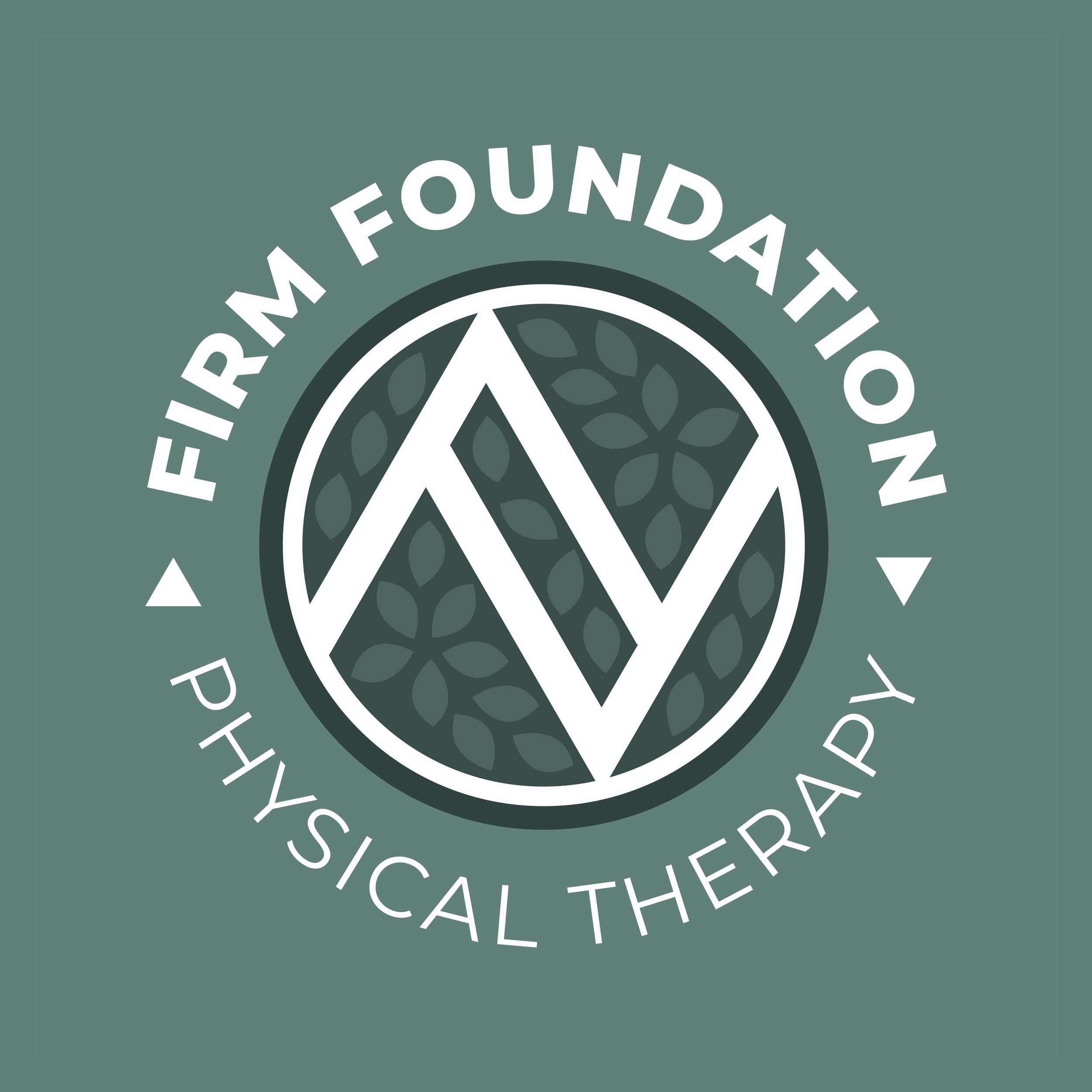
Kristie’s tagline, "A space for highs, lows, and growth," captures the essence of her practice, acknowledging the complex nature of each individual's journey. She sees people as full people, not just the physical problem she’s helping them with. The logo design incorporates an up arrow for "highs," a down arrow for "lows," and a subtle leafy pattern for "growth." This combination not only visually represents the tagline but also forms a double 'F,' representing the name Firm Foundation.
To evoke a sense of tranquility and a connection with nature, we carefully curated a monochromatic green color palette. From the strong tones of forest green to the more subtle shades of laurel green, this choice not only creates a cohesive and polished appearance, but also mirrors the calming and nurturing atmosphere Kristie envisions for her practice.
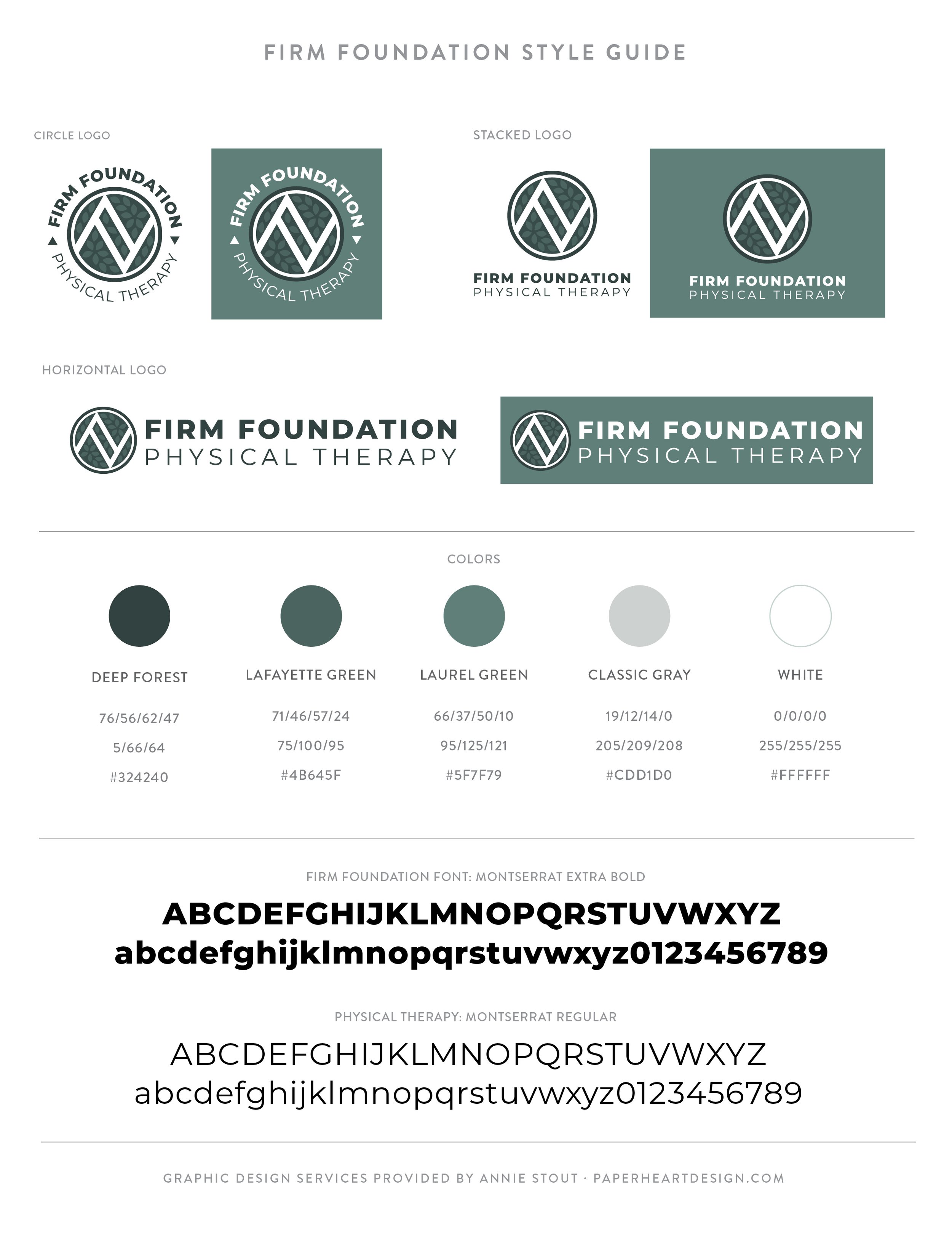
The final logo design encapsulates the essence of Firm Foundation Physical Therapy—providing a safe space for healing, growth, and genuine connections. This versatile logo suite provides circle, horizontal, and stacked versions of the logo and a stand alone icon, which will all serve Kristie well for different applications and provide cohesive ways to promote her business.
As Firm Foundation Physical Therapy prepares for its grand opening this month, the logo stands as a symbol of Kristie's dedication to offering a client-centered approach to physical therapy. We look forward to witnessing the positive impact this practice will have on the Midland community!


In an effort to foster a creatives community I’ve started a Facebook group called Art is a Record Creatives Community, the same name as this blog. I would love for you to join in the fun as we discuss creative living, projects, art, and life.
