
Logo Reveal: Burdzinski & Partners
We had the recent pleasure of creating a logo, brand identity, and building a new website for Burdzinski & Partners.
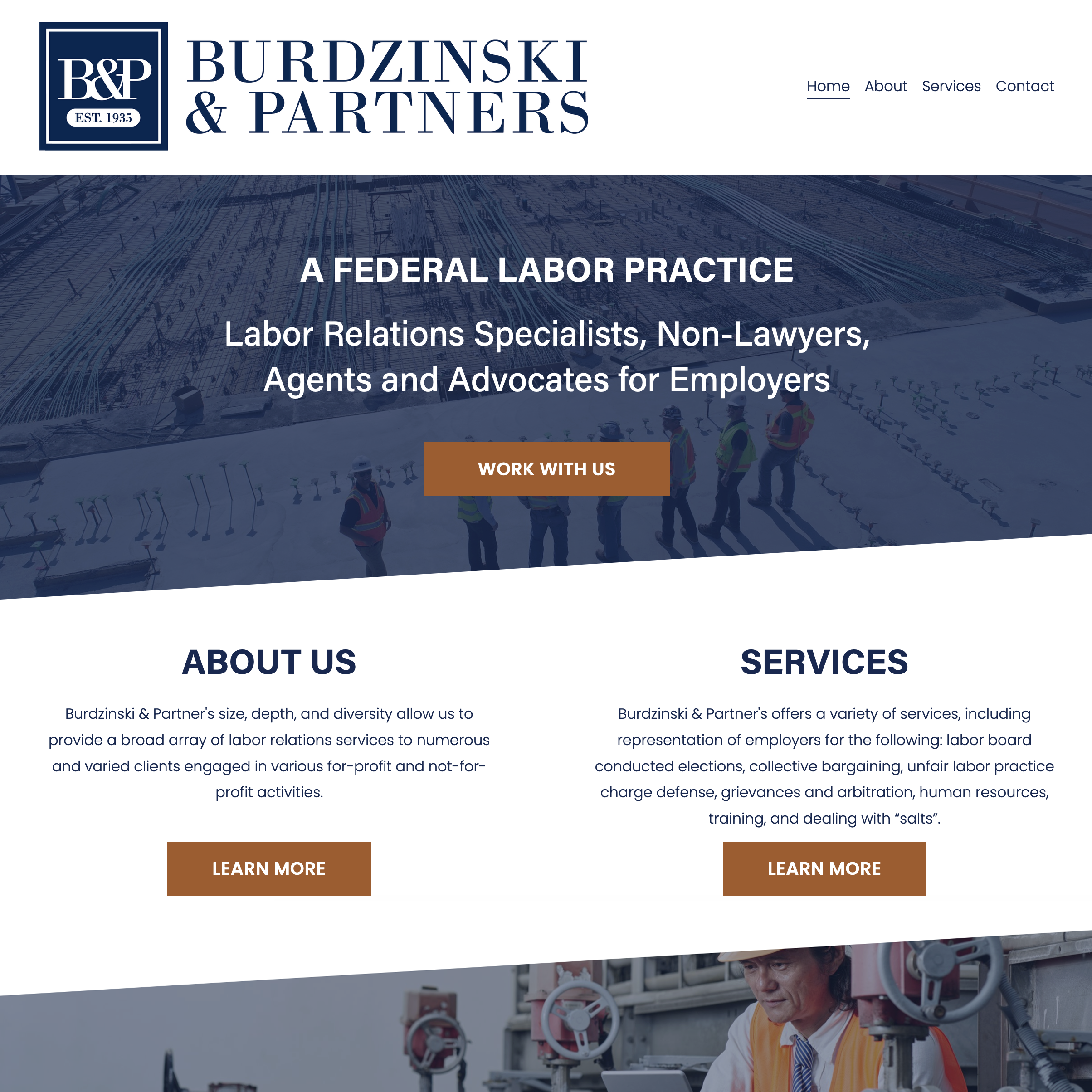
This locally owned business is a federal labor practice with the locations across the USA. When we first met, I didn’t know what a federal labor practice was as, but I knew a business that’s been around since 1935 was one worth learning about!
Our approach to the logo design focused on blending a traditional and modern ideas. They wanted something to show their clients at a glance, that they are a professional and trustworthy business. We accomplished through colors and incorporating the established year. In addition, we selected a classy and classic serif font for the logo, then paired it with a clean and modern sans serif font for copy, which provides great readability.
One of the key objectives in the website redesign was to shift from away from the nautical photography that was on their old site, to a more people focused use of photos. Because Burdzinski & Partners works across many industries, it was simple to incorporate images from industrial job sites, to healthcare, to food service, and beyond. We created a clean navigation bar to ensure visitors could easily find relevant information about the firm’s services and capabilities.
This was a great collaboration and we are grateful to have been part of it! Learn more and explore the full website at burdzinski.com


In an effort to foster a creatives community I’ve started a Facebook group called Art is a Record Creatives Community, the same name as this blog. I would love for you to join in the fun as we discuss creative living, projects, art, and life.
