
Logo Reveal: Downtownsend Terrace

A great logo is more than just a visual. It is a story, a feeling, and a first impression. I am excited to share the new logo design for Downtownsend Terrace, an exciting new gathering space taking shape in the heart of Downtown Midland. Located on Townsend between Larkin and Main Street, Downtownsend will bring a touch of Paris to Midland with French-inspired seating, pergolas, planter boxes, and its signature ‘Love Fence.’ Pitched by Brandon Morey, owner of Crêpes et Amis and Iron Dame Baked Goods, as part of the Midland Young Professionals (MYPros) Community Crowdfund for 2025, the vision is to create a place for people to connect, relax, and enjoy the charm of outdoor café culture right here in our own downtown.
INSPIRATION
When I heard about the ‘Love Fence,’ an installation where visitors can attach locks as a symbol of love or friendship, I knew it had the potential to become an iconic part of the space. That is where I began my design process.
The single word “Downtownsend” is quite long, so I explored ways to visually balance it with a second word while also capturing the concept’s essence. Terrace quickly came to mind, a Parisian tradition of open-air seating used by cafés and restaurants to welcome guests. It perfectly describes what this project is all about: conversation, connection, and community.
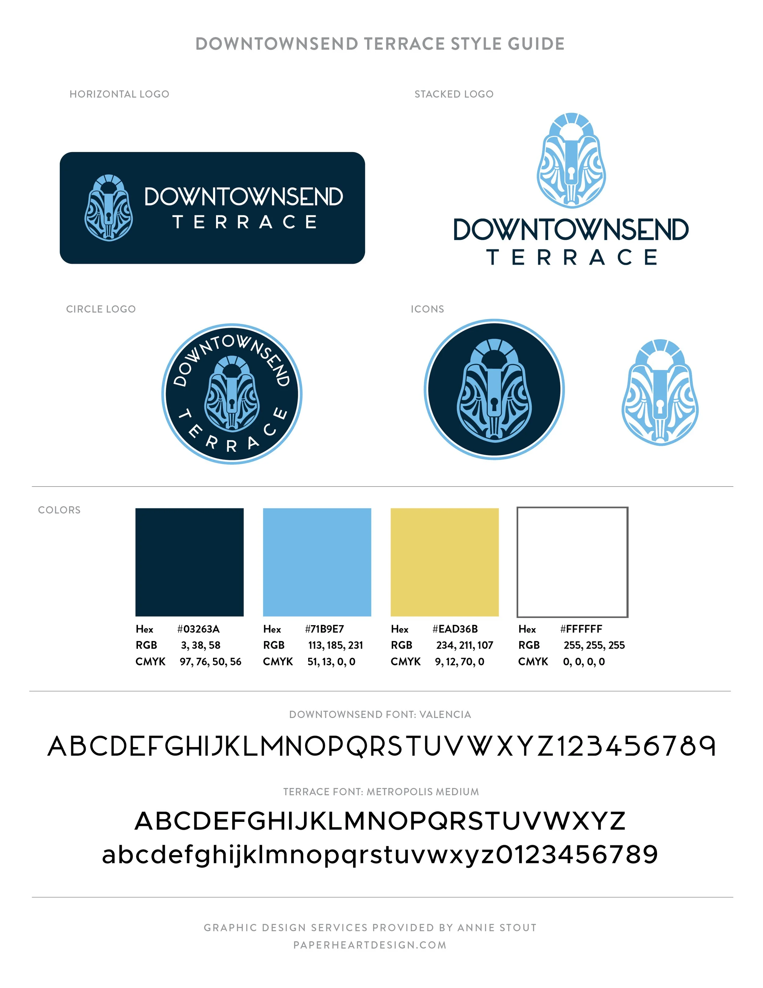
The Logo
A logo needs to be memorable and scalable more than it needs to be overly descriptive. Rather than creating a logo of the literal streetscape, or icons from the businesses on Townsend, the ‘Love Fence’ offered a perfect focal point for an icon, something unique to this space that people will instantly recognize.
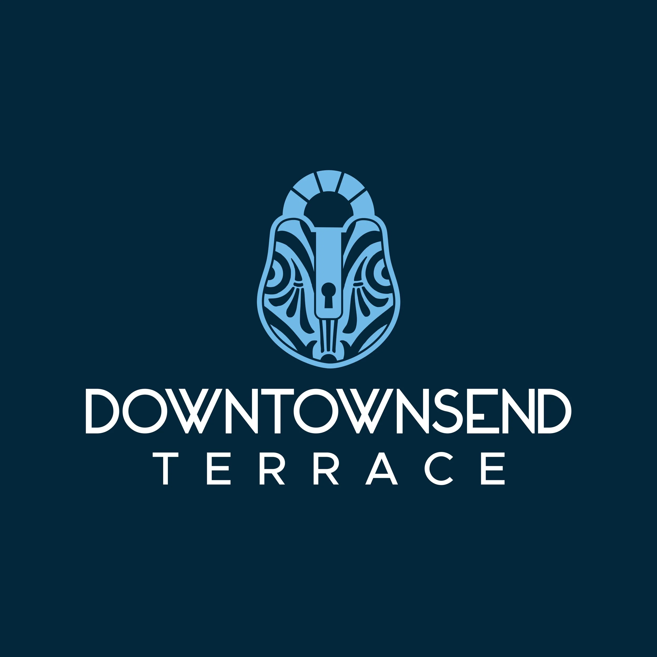
The lock in the logo is modeled after an antique French design, complete with filigree details to add elegance. The top ring of the lock incorporates the inner ring of the Downtown Midland logo, creating a subtle connection between the two identities. I also pulled the soft blue directly from the Downtown Midland palette, a shade reminiscent of the classic “French Countryside” blue.
For the typography, I chose a modern font with a subtle Art Deco influence to give the logo a timeless yet current feel. The word Terrace is set in the Metropolis font, which complements the “Downtown” lettering style in the Downtown Midland logo. This allowed for a clear visual relationship without the two logos feeling identical.


The Bigger Picture
Downtownsend is more than a name. It is a community-driven placemaking project. The Midland Young Professionals are leading a crowdfund to raise $25,000, unlocking $35,000 in matching funds to bring this Paris-inspired vision to life.
You can be part of transforming Townsend Street into a destination where locals and visitors can gather, connect, and create memories. From French-style terraces to the iconic Love Fence, Downtownsend is set to become a landmark in Downtown Midland.
If you would like to support this project, visit the Community Crowdfund page before August 31 to learn more.
Want to create a logo as bold as your vision? Let’s chat about how Paper Heart Design Co. can help you bring your story to life.
In an effort to foster a creatives community I’ve started a Facebook group called Art is a Record Creatives Community, the same name as this blog. I would love for you to join in the fun as we discuss creative living, projects, art, and life.
