
Paper Heart Design
When it comes to graphic design, logos are my absolute favorite. I rebranded Paper Heart Design back in April 2017 and was happy with where I landed on that design, but... since then I’ve been working through health problems that have shifted my perspective on the world. I feel like I’m out of that awkward artist who is trying to be a small business owner phase, and have come into my own as an entrepreneur. My kids are growing up and are becoming more independent… I’ve come into this renewed appreciation of simplicity, process, skills, hard work, and authenticity. In art, but also in life in general.
I wasn’t planning on rebranding Paper Heart Design this year, but when things shift in me, it tends to shift in my work. I was struck with inspiration recently and this rebrand rolled out in less than 48 hours. Crazy right? When something works, it works.
This is the new logo and some of the variations I have in my new branding arsenal.
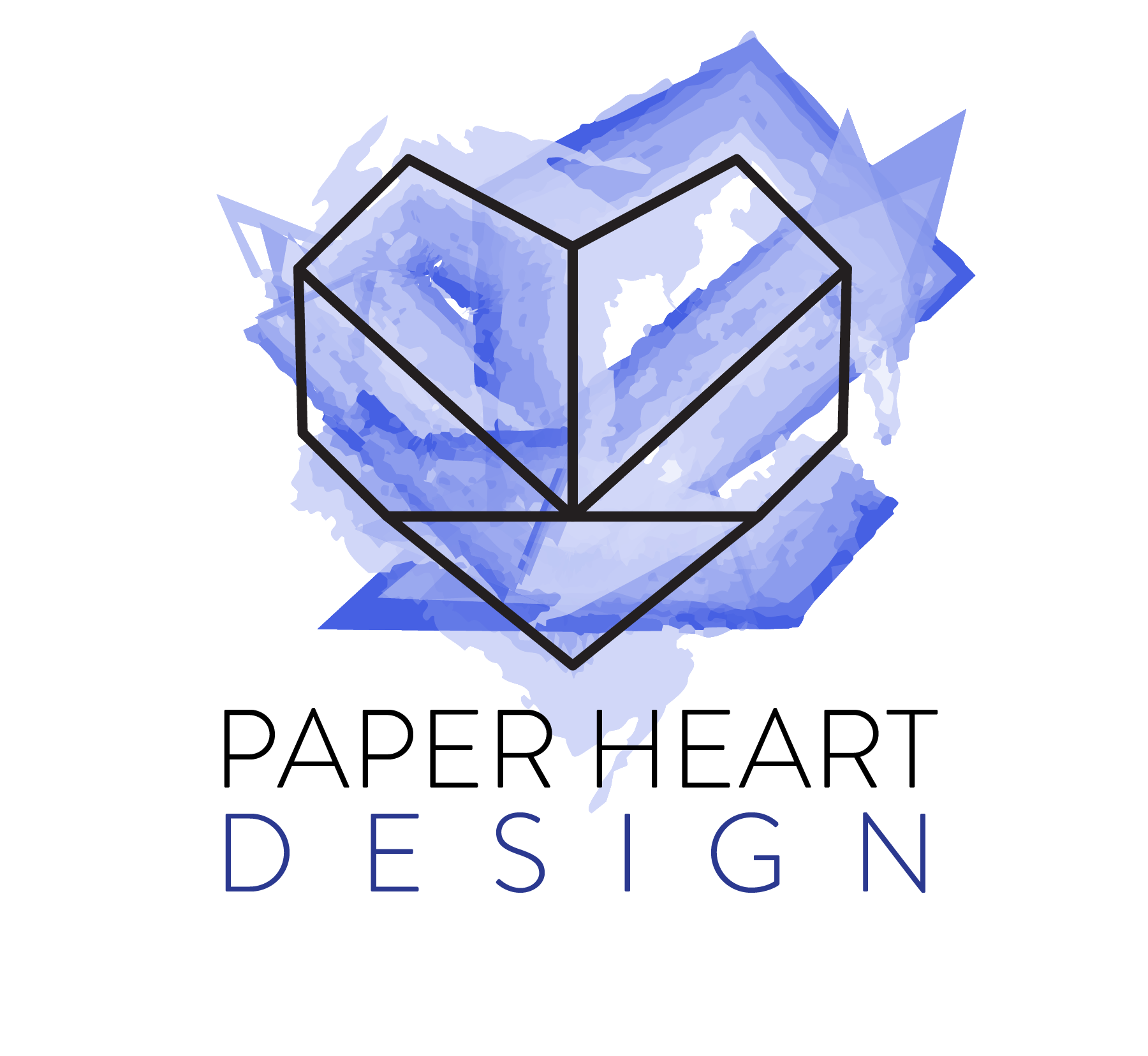


In my brain shift to simplicity, I’ve been thinking a lot about technology, skills, and art. I keep comparing digital to analog. As a graphic artist, all of my client work is digital. I really enjoy working digitally. I can control all the elements as I please and I can fix every mistake with a simple Crtl+Z. This has caused me to want do create more analog art, and I have been. I was thinking about the literal words in my company name, paper + heart. A literal paper heart… The idea of my digital business being represented by something simple and analog was very appealing to me. From there I folded an origami heart, then used those lines as a guide to create my new logo. At first I experimented with red, thinking I would stick with that color pallet... Apparently I’ve moved into my blue period.
While we’re here and talking about branding, design and growth let’s take a painful look back at the evolution of Paper Heart Design’s logos through the years… Keep in mind when I first launched back in 2008 I was an Etsy shop focused on wedding invitations and stationary. Also, years of experience show, and hindsight is 20/20!

My very first logo from 2008

My first business card design. I printed these 12 at a time at home in a variety of colors. I also used my full name, Andrea… so fancy!

Things got a little too grungy + too pink in 2009.

In 2011 things got a little cleaner, but still pink…

I had a blogspot blog? Hmm…

2016 was a big move in the right direction!

I was definitely finding my style in this time.

2017… now you’re talking.

Clean + modern.
I still really like my branding from 2017 and, as I said, I wasn’t intending to rebrand at this point, but here we are! Thanks for taking a walk down logo memory lane with me! Even the bad designs are fun to look back on because I can see how much I’ve grown.
Keep an eye out for my new business cards soon. They’re going to be special!